Icons are an integral part of our designs. They are visual cues to indicate various actions, and they can give a unique identity to a product. But all too often we choose to celebrate their importance by downloading the same icon sets and making every icon for every website look more or less the same. What a way to treat something of such importance.
In order to address this problem, I have created a guide to help designers add visual depth to their icons and make them unique to the product they represent. This tutorial is largely inspired by the influential Google Material design.

Google’s Material Design Principles
As Google puts it, “material is a metaphor.” It borrows visual cues from the physical world and creates a new visual language to standardize all of their interfaces. Material Design principles are accessible and can be quickly applied to improve interfaces’ appeal and user experience.
1. Use Simple Geometric Shapes and Bold Colors

The flat design trend inspired Material Design, which is also based on basic flat shapes. Carefully select which shape best represents the element that the icon is portraying.
2. Add Depth With Subtle Shadowing

A drop shadow is a good way to trick the eye and give a sense of depth to your design, because it stimulates the effect of light being cast on an object.
Note that natural light is often simulated as coming from the top, left corner.
3. Use Color Shades to Replace Drop Shadows

Each color is used in multiple shades to simulate visual depth. For example, in the Gmail icon, you can see that different shades of red are used for the shape of the M, and a darker shade of gray is used below the envelope lid.
How You Can Do it Too: Step-by-step Demos
We’ll apply a simplified version of the Material Design style, and for each icon, we’ll only use three shades of the same color and keep the shadows flat and short, instead of the common “long shadow” effect.
Resources
- Download the ten icons we’ll be working with >here.
- Check the full free icon set from Google here.
Let’s get started.
1. Bolt Icon
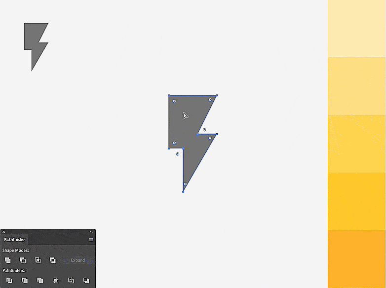
Break the original icon in two, and make the top part appear lifted. You can achieve this by creating a shadow effect at the intersection of the two shapes. Use three shades of yellow – lighter on top, a darker one at the bottom, and keep the darkest shade for the shadow.
2. Chat Icon
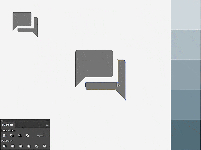
On the original icon, we have a hint of a shadow effect in the gap between the two bubbles, that’s where you’ll create a shadow.
On the lower shape, select the point forming the right angle in the gap, and move it upward to the left until you form a right angle at the top-left corner.
Duplicate the top bubble and move the copy down and to the right. Select the copy and the lower bubble shape, use the “Pathfinder” to create a division, and keep only the intersection with your previous copy.
Now you can apply three shades of blue and give the lightest on top, darkest in the middle, and the second darkest to the bottom.
3. Check Mark Icon
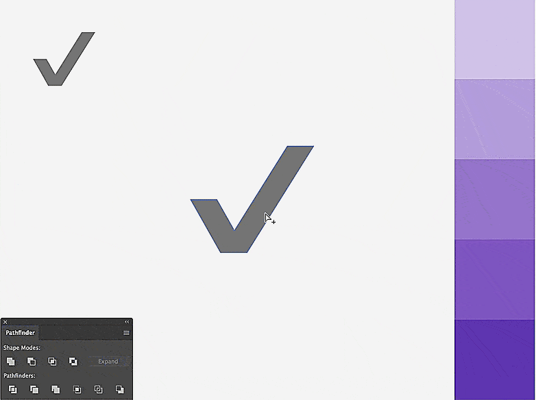
We’ll create a folded paper effect.
Duplicate the icon, and remove the extra two points at the very top right, then at the far left to get two pieces out.
Duplicate the left fold, and move it on top of the right one.
Intersect the two shapes to create the shadow effect. Then apply three shades of color while keeping the darkest for the shadow, second-darkest for the long piece, and the lighter shade for the top.
4. Flag Icon
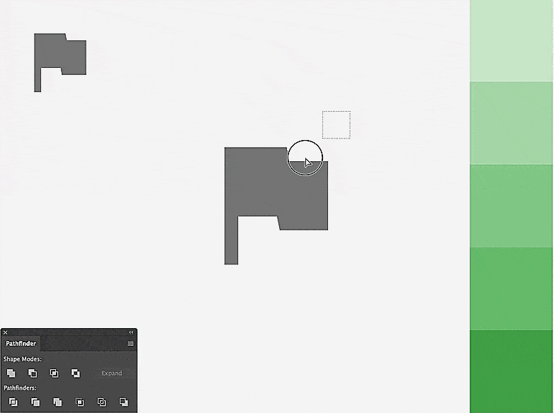
Start by rounding the edges, then extract the base of the flag.
To create a folding effect, trace two lines intersecting diagonally. Using the ”Pathfinder,” divide the flag shape with the lines, and apply three shades of green to the flag while keeping the base gray.
5. Heart Icon
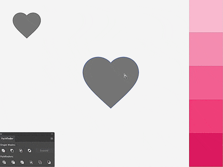
Duplicate the heart icon.
Isolate the left half of the shape.
Trace a diagonal line downward, coming from the top-right point.
Overlap the resulting shape with the heart, then move it to the right to subtract the shadow shape. Apply your three shades of pink.
6. Mountains Icon
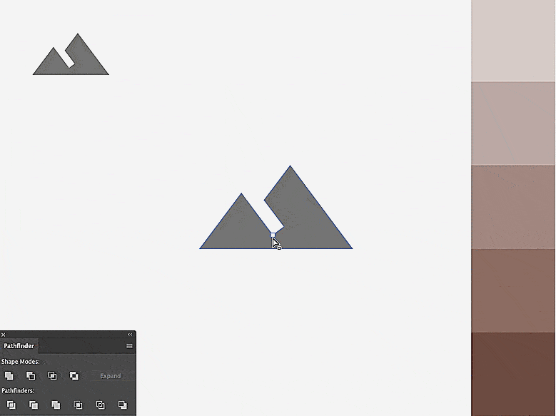
The empty gap inside the original icon indicates where we can place a shadow.
Create the two triangle shapes out of each pick.
Move a copy of the smaller one to the right, and extract the resulting intersection as the shadow shape.
Apply three shades of brown by keeping the lightest to the left, the second lightest to the big triangle, and the darkest for the shadow in the middle. Apply some corner radius to soften the result.
7. People Icon
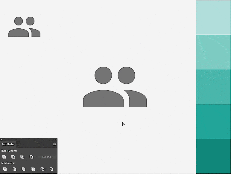
Select and duplicate the lower portion of the person to the left. Align that copy with the person to the right. Now, select the three overlapping shape, and apply the “Divide” tool from the “Pathfinder” panel. Now, implement the colors to finish up.
8. Floating Square Icon
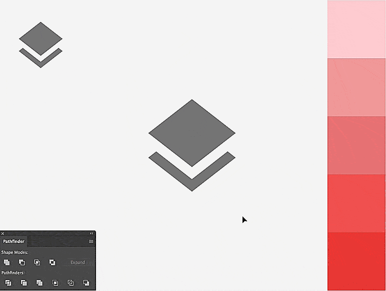
Select the lower shape, and move its middle-top point upward until it looks like a diamond.
Duplicate the upper diamond shape, and move the copy down 10 or 20 px.
Select the two lower shapes, and apply the “Divide” tool from the “Pathfinder” panel.
From the resulting intersected shapes, only keep the two lower pieces, and delete any extra points.
Wrap it up by applying three shades of red while assigning the darkest in the middle.
9. Letter Icon
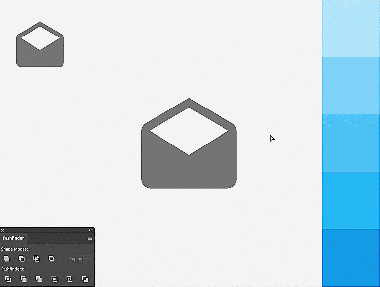
With the “Direct Selection Tool (A),” choose the second higher point of the envelope shape.
Add a point on the segment to its right using the “Pen Tool.”
Now that you have an extra point, you can reshape that negative space to look like a paper by lifting the two upper points and moving them right and left like shown.
Select everything, and apply a division from the “Pathfinder” panel. Separate the top paper shape from the envelope, then duplicate the envelope part on top of the paper to cut out the shadow shape before applying three shades of blue.
10. Cake Icon
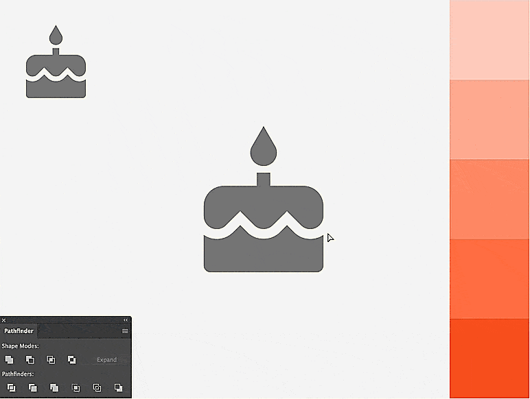
Isolate a duplicated version of the bottom part of the cake.
Narrow its width by moving the left and right edges inward.
Move the resulting shape on top of the original icon, and extend the higher points to overlap the icing shape.
Create a division of all the overlapping shape with the “Pathfinder,” and remove the extra points beside the narrow cake base you created earlier.
Complete your cake by applying a light orange to the icing and candle, a darker shade to the base, and an even darker orange for the flame shape and shadow edge.
Improve Your Icon Set’s Look and Feel
Creating icons with Material’s style can be achieved with simplicity. You only need a good combination of thoughtful geometric shapes, bold color shades, and a drop shadow effect.
The good news is, you don’t even need to create all the icons from scratch, like we did in this tutorial. You can start from existing free, flat icons, and apply the simple techniques you just learned.
I’d love to see what you can come up with. Feel free to share your comments and custom icons.
Raleted : How to Quickly Turn Boring Icons into Original Masterpieces