Design agency Pentagram has created a new logo and visual identity for Mastercard, the credit card company’s first branding redesign in 20 years.
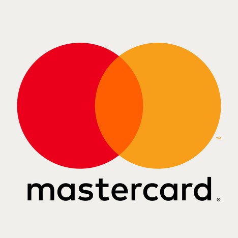
The new design retains the two overlapping red and yellow circles, but swaps the stripes in the central portion for a block orange colour.

The bold white text that spelled the US company’s name has been replaced with the FF Mark typeface – all lower case – and positioned outside the symbol.
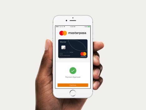
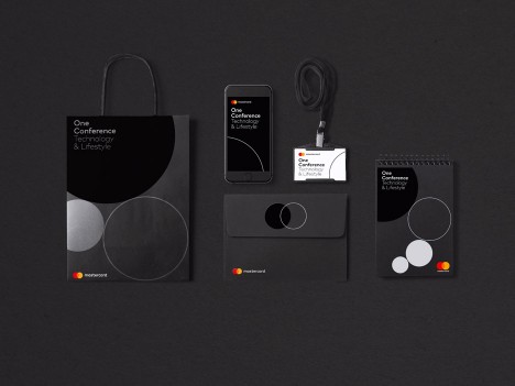
Pentgram, which has created branding for everything from MIT Media Labto Snoop Dogg’s edible marijuana range, has also updated Mastercard’s website graphics, information pamphlets, billboards and other marketing materials.

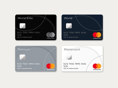
The typeface is used in a variety of weights across the applications, while circles in different sizes and opacities also feature.
Although Mastercard’s corporate branch had a logo refresh in 2006, the company has stuck with the same public design since 1996.

The logo has remained largely unchanged since Mastercard was founded in 1966, however the new update aims to help bring the company into the digital age as more card transactions are done online and via apps.
“Everything has changed in the past 20 years,” Pentagram partner Michael Bierut told FastCoDesign. “There was a lot of screw tightening and design tinkering happening [with the logo] in the first 30 years of the company. Then they almost got frozen in 1996.”

“We took their DNA and went through this process of distillation,” he added. “With each wave of simplification it felt sharper cleaner and more flexible.”
The logo continues the trend for flat design, which has been adopted by companies like Instagram, Uber – replacing skeumorphic graphics that aim to emulate real-world objects on digital screens