In today’s digital landscape—more than ever—people are aware of typography, design and how the world looks around them. Gary Hustwit records this in Helvetica, a documentary about how fonts affect our everyday lives. Most notably, Helvetica ushers in the larger conversation about global visual culture, detailing how and why people are progressively more mindful about the visual impact of design.
“The world is full of beautiful fonts—choosing the right one for your next project can be a daunting task.”
When working with a digital marketing agency, it is important to be prepared to discuss fonts during the creative process. And you may hear terms like sans serif, slab serif, or script—but this isn’t a bunch of mumbo jumbo, it’s science!
Here are five tips to help you understand fonts and why they are so important.
1. Fonts vs. Typefaces
Fonts, typefaces… what’s the difference? Here’s the easiest explanation to remember:
- A font is a grouping of typefaces that have similar characteristics.
- A typeface is referring to an individual family member of that font.
Take Gotham for instance:
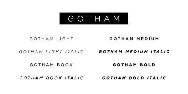
Gotham has many typeface variations, but each falls within the parent font, Gotham. Specifically, Gotham Italic is a typeface; it resembles all things Gotham but looks slightly different. Think of it as one big happy family—each typeface is unique and special, but they all share the same font name.
Font Tip: Knowing the kinds of typefaces you have to work with or want to use will give you a good foundation as you develop your digital presence.
2. Know the Big Players
There are an overwhelming amount of fonts at our fingertips, but first let’s talk about the main categories of fonts out there.
Serif: Serif is the slight projection at the end of a stroke that’s most commonly seen at the bottom of letters. If you look closely, some fonts will have “little feet” on them. This is what characterizes it as being a Serif font. This allows the eye to flow through sentences with ease.
Sans Serif: Fonts that are Sans have no “feet,” or serif. Take a look at the diagram:
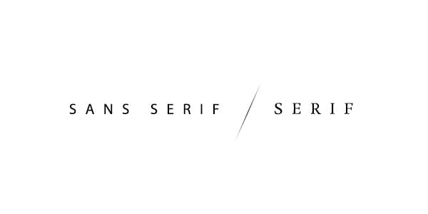
You can clearly see the difference above between a Sans Serif font and a Serif font. Sans Serif fonts are often modern, trendy and streamlined, however they tend to be harder to read at smaller sizes.
Script: This font type is known for its elegant, light and professional appeal. You often see this kind of font written on wedding invitations, diplomas or certificates. Use this kind of font sparingly. It’s not designed to be used as body copy or used in small spaces.
Display: You often see this kind of font on movie posters, newspapers, banners, etc. It’s intentionally designed to grab your attention or to give emphasis to a certain area. This is another font that’s not meant to be used in large quantities—a little goes a long way.
Hand Lettering: These kinds of fonts have hand rendered characteristics. Maybe they look as if a child has written it, or as if someone used a Sharpie or whiteboard marker to jot something down. Designers like to use fonts like this because they add a human element to the design—something that people can relate to.
Font Tip: There are a lot of great fonts out there, but keep in mind, you get what you pay for. Make sure the font you choose is high quality.
3. The Art of Visual Language
Various fonts and typefaces carry a lot of meaning and character in the way that they look. You must remember this when you are choosing a font for your next project—a font can completely change an intended message depending on how or where you use it. Look at this illustration for an example.
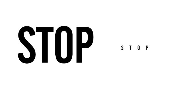
“Stop” on the left seems to almost be screaming at you. Whereas, “stop” on the right is very timid, faint and almost weak.
Jessica Hische, a well-known and respected letterer, illustrator and blogger wrote in Upping Your Type Game:
“Typefaces definitely have personalities…I usually want something even-tempered and laid back but not lacking in personality. Finding typefaces with the right personality balance can be incredibly difficult…”
Typography is the vehicle through which we communicate tone of voice, age, gender, emotion—and it can be easily manipulated. Visual characteristics of the font do speak louder than words.
Font Tip: Your designer will use certain typefaces and fonts for a reason. Feel comfortable to ask why—designers love to talk shop!
4. What’s the Big Deal?
Does a well-thought-out font choice really matter? Do people really notice when a bad font was chosen? Does it really dictate what people do?
Absolutely! And here’s a prime example:
In 2009, PepsiCo’s popular orange juice brand, Tropicana Pure Florida Orange Juice, underwent a major rebranding.
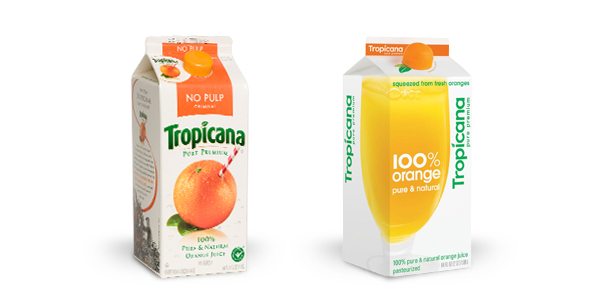
If you look closely, the name “Tropicana” changed from its classic font look to a hip, sans serif looking font… and within two months, sales dropped a whopping 20%, costing the brand tens of millions of dollars.
Needless to say, they quickly got rid of the new look. The font on the classic carton of orange juice WAS Tropicana. The font felt and had a visual message that was meant to be forever with Tropicana. Anything else just seems stale—and really, who wants stale juice?
Font Tip: Fonts matter. People are being consciously and subconsciously influenced and directed by various font choices all the time. Be sure you’ve considered all the direct and indirect impacts of your font choices because they can drastically dictate how your audience feels, and even how they’re called to action.
5. Stick with What Works
From a brand perspective, stick with what works. Don’t get too excited about constantly changing just because the times are changing. If you have a visual landscape that works, stay there. Don’t go changing fonts and typefaces for no apparent reason. However, there are plenty of businesses that have changed with the visual landscape for the better. If you sense that your brand is ready for a refresh, be creative! Experiment with different kinds of fonts and have fun.
Font Tip: Know when to ask for help. Deciding on a visual direction can be hard. Don’t hesitate to bring in the professionals if you’re not totally sure where to start! A professional digital marketing agency should not only be capable to help you, but excited and happy at the opportunity work collaboratively to figure out the next big step to strengthen your digital presence.