Improve your skills and workflow by exploring these five oft-overlooked aspects of Illustrator and typography; the differences between optical and metric kerning, how to use the Glyphs panel, the use of Roman hanging punctuation, the correct use of dashes and how to edit the preferences to display large font previews… all tips worth knowing about.
1. Optical vs Metric Kerning
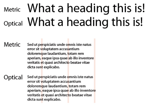
Throughout the Adobe CS, by using the Character panel, you can automatically kern type using metric kerning or optical kerning. Knowing which one to use and when is usually based on what font you are using and how many built-in kerning pairs it has within the font. For text, metric or auto kerning is usually recommended though if you are combining different fonts or type sizes, you might consider Optical settings as Illustrator will adjust the letter fit for you. Optical settings can often yield better results for display type.

2. Glyph Panel
The Glyphs panel, found in Illustrator and InDesign allows you to access a font’s full character set. You can find the Glyphs panel by going to Window > Type > Glyphs. Once open, create a text field and then double click on the glyph you wish to use. Another tip here is to explore the full family of a particular font as you will find that some glyphs only appear in Italics. Three families with beautiful glyphs include Minion Pro, Burgues Script and Bickham Script Pro.

3. Roman Hanging Punctuation
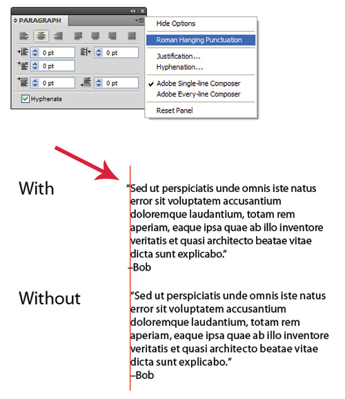
Roman hanging punctuation is an oft-overlooked area of typography, though, in more cases than not, applying it will give the edge of your body copy a much cleaner line. By default this option is turned off, however, you can turn it on in the Paragraph tool panel. In the Paragraph tool panel, click the small arrow facing downwards (see pic below) to find the extra options and then click Roman Hanging Punctuation. You will find other extra options here, all worth exploring.

5. Large Font Previews
Choosing the right typeface for your particular project is not always going to be an easy task so why not make it a bit easier on yourself and bump up the sizing of your font previews. To do this, go to Edit > Preferences > Font Preview > Large. While you’re here you may want to explore the other options available in the preferences panel, something many designers overlook. It may just improve your workflow.

Hyphens Are Not Dashes
There are three types of dashes and they should be used for their appropriate purposes (admittedly I am pretty lazy with this). Below are the definitions and the ASCII codes needed to use each dash, along with examples.
The Hyphen – (-)
A hyphen is used to separate the words in a compound adjective, verb, or adverb.
eg. “Re-read the subhead above.”
The En Dash – (–)
The En Dash is used to express a range of values or a distance.
eg. “My guess is 5–20 people will actually listen to this advice.”
The Em Dash — (—)
The Em Dash is used to give a sudden break in thought.
eg. “I was thinking about writing—what issue did you say this was being published in?
“The MAC shortcut for an en dash is Alt + – and the shortcut for an em dash is Alt + Shift + -. For the PC it seems there aren’t any but some people set up ctrl + – for en and ctrl + shift + – for em in the required program. I find it has made my converting of dashes much easier and worth doing.” THANKS FOR THE TIP MITCHELL HARRIS.