So you want to be a Fontographer—boldly traversing a sea of letters, mapping new alphabets with naught but a pencil and mouse for companionship. Or maybe you simply have a vision for that special project, and you want the typeface to be “just so.” Creating your own font has never been easier, so set forth and learn how to make your own font.
Step 1. Start by reading

You’ve been writing for most of your life, so by now you’re a master of crossing t’s and dotting i’s. Yet making a deliberate typeface is full of secret perils, such as spacing issues you’ve never considered unless you’ve had formal training. For example, round forms (like o) must fall closer to each other than straight forms (like N). The letter O should be ever so slightly taller than the letter H.
These points seem subtle, but if you skimp on the scholarship, you won’t like the result. Your typeface will look incoherent, like Print Shop fonts from the dot matrix days. Train your eye and your mind. It’s an investment.
For a crash course in some form concerns for the beginner or for a great introduction to global form and style concerns in typography, try the following resources:
- Tyepeworkshop’s “Basics;”
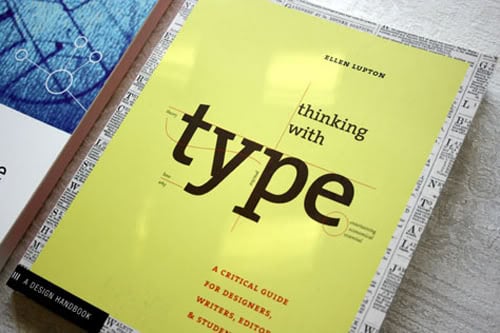
- Ellen Lupton’s Thinking with Type;
- Robert Bringhurst’s Elements of Typographic Style;
- And the web companion Elements of Typographic Style Applied to the Web.
Step 2. Get the full picture by sketching

It’s true that some font designers work entirely on the computer. For your first font, this isn’t a great idea—you learn so much more about the feel and interplay of letterforms by drawing your first alphabet on paper. Get your tweaking finished now while you can see the big picture. Make major corrections to your font in pencil rather than editing on software.
Keep it neat—your sketched alphabet provides the graphic skeleton of your finished digital font. At this point, the quality of your letters’ line and geometry matters more than the spaces in between letters and lines. You can edit the spacing later. When you’re satisfied, ink your font to get it ready for scanning!
Step 3. Scan and convert to vector
Some guidelines for the beginners out there: Scan in grayscale; 300 dpi should give sufficient detail. Clean up the letters, first using Photoshop’s Curves tool, or a similar program, to remove stray lines and smudges, and then editing with brush and eraser tools as required. Convert the alphabet to vector art before continuing.
Step 4. Learn a Font Software

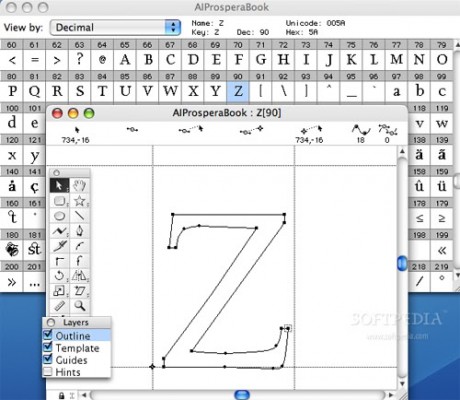
Today there are many great font tools, but the best for beginners may be that old standby, Fontographer. Why? It’s been around the longest, has the largest number of Internet experts, and the web is full of great tutorials. For example, Sitesource has a lively tutorial. If you’ve mastered Photoshop, font software should give you no pause. You should have your font in working order post haste!
Creating your first font is often a hard odyssey born of necessity. Your second should be an exploratory expedition—stretching your graphic design abilities to create something beautiful. There’s a high learning curve, so keep at it—your third foray into fontsmanship will be a cruise.