Creative Characters, which debuted July 2007 from font distributor MyFonts, is a monthly newsletter interview series with some of today’s most respected type designers. The series provides a rare opportunity to learn more about the people who create the typefaces we love. Here are a few gems from the collection:
Alejandro ‘Ale’ Paul

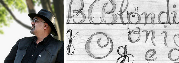
Alejandro Paul, photo from typoberlin.de
Alejandro Paul is a co-founder of the first Argentinean type collective, Sudtipos. Known for his many script fonts, he recently received his second Type Directors Club award for his typeface Adios Script. Starting out as a graphic designer, he explains how he transitioned naturally into a type designer:
“As a student I had to make my designs unique in order to stand out. Type is a design element that helps accomplish that in a big way. At first it was just things like applying type effects, or slightly modifying a letter here and there to make the design more personal. After graduation, real-world packaging design was an eye-opening experience as it implied looking at type very closely. For example, when you have to design the front of an ice cream container, common ‘fashion’ fonts almost never work exactly the way you want them right out of the box. There are millions of containers that use the word ‘light,’ and the last thing you want as a packaging designer is your design to be plain or impersonal or look like someone else’s.”
Patrick Griffin
Along with Rebecca Alaccari, Patrick Griffin operates Canada Type, an independent font studio in Toronto. Despite only emerging a few years ago, the studio has already created a huge amount of both custom and retail typefaces, including some revivals like Clarendon Text. Coming from a set design background, Griffin had an unusual entrance into the industry:
“My background is design in general, and set design in particular. Designing props, sets and collaterals for dramatized documentaries and commercials, that sort of thing. I did that for about sixteen years, and there were my first exposures to type. A few months into my rookie year, colleagues began calling me a type freak. Most of them could not relate to the obsession, even those who were doing the exact same things I was. So I think it’s the other way around. You don’t get into type. Type gets into you.”
Cyrus Highsmith
A senior designer at Font Bureau, Cyrus Highsmith also teaches typography at the Rhode Island School of Design. He has some interesting advice for his students:
“The best advice I ever got as a student was ‘Quit school!’ I had already dropped out by the time I got it but it was nice confirmation. If you are not into school, don’t waste your time and money. My best students are often the ones who have taken time off previously or went to the wrong school first. When they get to my class, they are focused and ready to learn.”
Christian Schwartz
Publishing his first professional typeface at 14 years of age, Christian Schwartz quickly became one of the most prolific type designers in the USA, publishing fonts with about half a dozen foundries. Schwartz reveals his secret to success:
“My secret to coming up with good ideas is that I work with amazing collaborators. Sometimes these collborators are type designers, like Paul Barnes, Kris Sowersby and Tal Leming. Sometimes these are clients: David Curcurito at Esquire; Mark Porter at The Guardian; Roger Black, on a number of projects. Erik Spiekermann manages to be both a co-designer and a client all at once.”
Underware
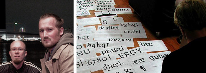
Underware is a graphic design collective consisting of Akiem Helmling (German, The Hague), Sami Kortemäki (Finnish, Helsinki), and Bas Jacobs (Dutch, living in Amsterdam). Besides creating original typefaces (including Auto), the group publishes books and magazines, hosts workshops, and broadcasts Typeradio. Despite being in different locations, the guys manage to keep it together:
“The main thing is trust. If one of us does something stupid, we don’t lose faith. Next time it will be the other guys’ turn to make a foolish mistake. What keeps us working together is that we keep appreciating the differences. We still get surprised by the stuff on the other side of the wire, and we’re aware that none of us would be able to achieve on his own what we can do together.”