Direct marketing is all about connecting with customers in a real way. To accomplish this effectively, you often have to come up with some crazy unique and inventive ideas. The next time you’re in a meeting where people are ideating about direct marketing ideas, use these as inspiration to wow the group!
All of the examples below are from Ads Of the World, an excellent online source for all kinds of real and conceptual advertising and marketing examples. This is a truly invaluable inspirational resource for anyone involved with printed marketing deisgn.
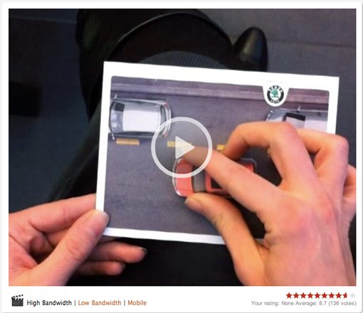
Skoda Yeti: Park Assist System
This Postcard was meant to advertise a new parking assist feature on a car. The card contained a little car that you tear off of one side and place on the other. When you stick it onto the designated spot, magnets unexpectedly push the car into the tight parking spot!
Click the link to check out the video and see the card in action.
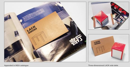
IKEA Lack Side Table: Pop-up
I just love these little 3D popup ideas (there are several in this post). The basic idea is to engineer something that ships flat but pops up into a 3D object when the receiver opens it. It’s completely uncommon for a Postcard or magazine to jump into the third dimension so even if it’s been done before, the element of surprise is huge and impacting.
This implementation advertises IKEA’s famously cheap little square tables. When you open the magazine insert, out pops a little IKEA table to remind you that you’ve always though about picking a few of those up.
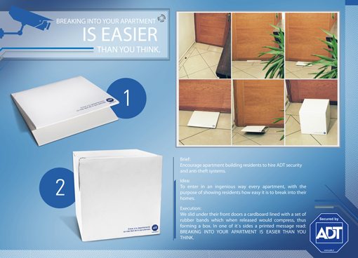
ADT Security System: Box
This one is my favorite on the whole list. It’s probably a little too evil and would surely invite a frivolous lawsuit or two in the U.S., but the shock of seeing this would be pure gold.
The general idea is the same as the IKEA table above. There’s a flat box that is engineered to pop up into a cube. However, this one is much larger and is slipped under the doors of the inhabitants in an apartment building (a mail slot execution could work too).
The effect is that when someone walks in, they see this huge cube in their apartment that says “Breaking into your apartment is easier than you think.” Obviously, it’s advertising a security system.
WWF Earth Hour: Candle Box
This one is fairly simply but proved quite effective. To encourage corporate CEOs to celebrate Earth Hour and shut down all the lights for a single hour, candles were sent to their offices.
The visual message is clear in the image below and the execution is pretty clever. Apparently, corporate support increased 260%. I’d call that a success.
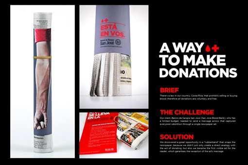
San Jose Blood Bank: Blood Donation
I love the simple but brilliant visual image presented by this one. All they did was wrap a paper ad encouraging people to give blood around a newspaper with a rubber band.
The effect: the rubber band looks like a tourniquet wrapped around the arm and offers an instant visual read to anyone who has ever had blood drawn. Simple, cheap, effective!
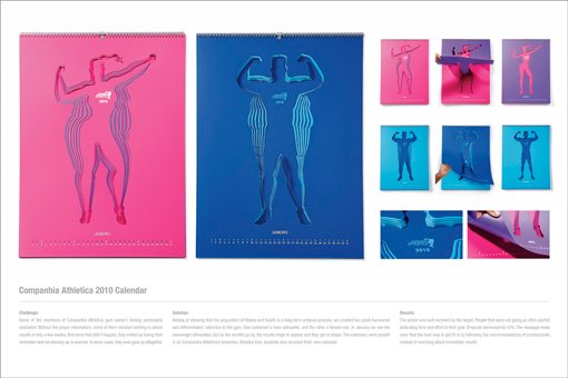
Companhia Athletica: Calendar
This one is interesting because it is directly aimed at solving a problem. Gym members often become discouraged after not seeing immediate results, which causes dropped memberships.
As a response, the gym gave out these funny Wall Calendars that helped members visualize the long process of losing weight and becoming fit.
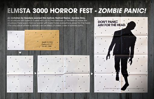
ELMSTA 3000 Horror Fest: Zombie Panic!
This one isn’t the best on the list but I still thought it was an interesting idea. The zombie film festival mailing sent out was covered in holes. When you open it you realize that they’re bullet holes and see a message that says “don’t panic, aim for the head.” The bullet holes appear just about everywhere but on the zombie’s head.
Junk mail is usually uninteresting and it’s a real task to get someone to actually open and read something (I know, I used to create junk mail for a living!). The holes serve as a way to prolong the trip to the trash can. It’s unexpected and interesting and your curiosity will force you to open the envelope and see what it’s all about.
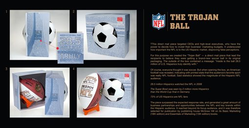
NFL: The Trojan Ball
This one is really interesting and is yet another angle on shock value. The package was sent out to high level CEOs who could influence their company’s marketing budgets. The box obviously looks like a soccer ball and contains the message “inside is the ball 28.5 million US Hispanics truly identify with.”
Naturally, the CEO expects to find a soccer ball inside but opens the box to find a football and an advertisement for the NFL. Any company that was really looking to effectively target hispanics (something advertisers do frequently in the U.S.) likely gave some serious thought to the message delivered here.
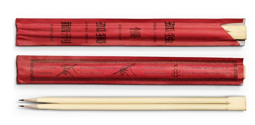
Amnesty International: Chopsticks
This idea puts a clever twist on a familiar item. Pencils that looked like chopsticks were given out and where the typical chopstick instructions are written, these steps were printed:
- Tuck under thumb and hold tightly.
- Write the Chinese government to help end torture.
- Don’t let human rights violations by the Chinese government give China a bad name.
- Take further action at amnesty.org/china
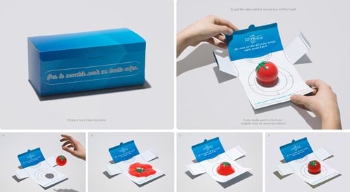
LavOnline: Tomato Splat
This campaign helped raise awareness for a laundry service and makes excellent use of some interesting materials. Consumers were sent a box containing a squishy toy tomato that could be thrown at the printed shirt on the inside of the box. The tomato completely flattens out and sticks to the box, only to gather itself up (cleaning the shirt) and become a full round tomato again.
If you don’t believe it would work, follow the link to watch the video and see the magic tomato in action!
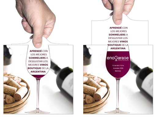
Enogarage: Wine glass invitation
This one shows that you don’t have to have a huge budget to make an interactive marketing piece. The simple wine mailer has one piece that pulls out of another. As you pull, the wine glass fills up.
Again, for these types of campaigns the main goal is to get the potential customer to merely look at the advertisement for a bit longer than they typically would. In this case, upon noticing the illusion the receiver is likely to play with it once or twice and perhaps even show other people present in the room.
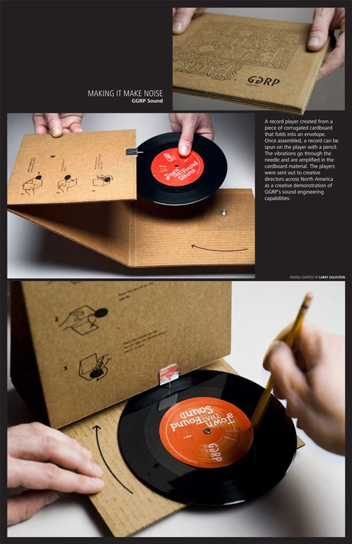
GGRP Sound: Cardboard Record Player
This one is nuts. Imagine you were tasked with sending out actual functioning record players (made of cardboard) as a way to advertise for a sound company. Could you pull off the task? These guys did.
The construction is genius. It ships flat, holds the record, and folds into place in only a single step. Then you place the record under the needle and spin it with a pencil. I’m not sure if the campaign was worth the time, money and effort they spent on it, but I can’t help but appreciate the final product!
Is it Worth It?
The examples above are all quite impressive, but the key question to ask is whether or not it was worth the expense. The problem with great direct marketing ideas is that they’re usually targeted towards a fairly small number of people when compared to a commercial or other more traditional advertising method. However, they have the potential to be far more impacting than mass media.
So what do you think? With a limited budget, is it better to make a small impact on lots of people or a large, meaningful impact on a small number of people. Also, which of the examples above do you think would effectively encourage action and which would merely be seen as an moderately interesting piece of physical spam that still hits the garbage can immediately?
