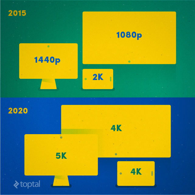
In recent posts, we covered a number of design-related hardware trends, and now, it’s time to get to the elephant in the room: The imminent transition to 4K or UHD displays. While many enthusiasts and professionals have already moved to these high pixel density displays, the average consumers have not.
However, as average selling prices (ASPs) go down people will be inclined to choose high-definition hardware over good old 1080p. This, however, will take some time, because product cycles are getting longer. People keep old hardware running longer than they used to, and the age of the average PC is currently estimated at 4+ years. The same is true of TVs and other hardware, but eventually, we will get there.
Let’s start with the basics and take a look at 4K/UHD hardware that will make our desktops as sharp as a ceramic knife.
4K Web vs. UHD vs. 1080p
Many people, including members of the tech press, tend to use the 4K moniker to describe all panels with a vertical resolution of 2160p. However, we are actually looking at two slightly different resolutions:
- 4K UHDTV 3840×2160 pixels (8.29 megapixels)
- Digital Cinema Initiatives (DCI) 4K 4096×2160 (8.85 megapixels)
UHDTV is more prevalent and it represents a fourfold improvement on 1080p with the standard 16:9 aspect ratio. DCI 4K has a not-so-standard aspect ratio of 256:135 and it’s not used on as many devices. It’s a resolution for professional cameras, projectors and monitors.
In addition to these two resolutions, we will also see a couple of others:
- 4K Ultra Wide 5120 x 2160 in 21:9 aspect ratio
- 5K WHXGA 5120 x 3200 in 16:10
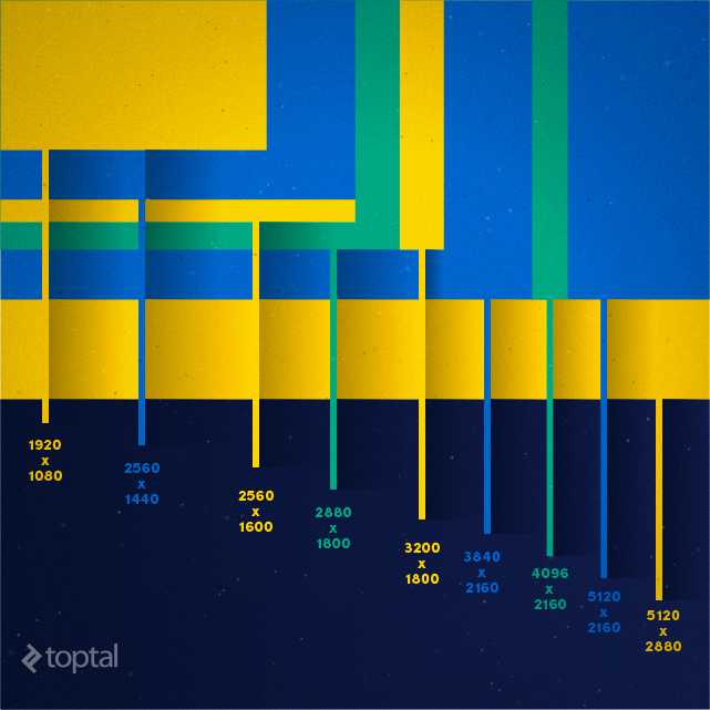
These resolutions are not nearly as common as 3840 x 2160, but they will certainly make their presence felt moving forward. Personally, I find 4K Ultra Wide attractive due to its aspect ratio and potential productivity boost. A number of “halfway” resolutions, such as 2560 x 1440, 2560 x 1600, 2880 x 1800 and 3200 x 1800 will be used in laptops for years to come.
Right now, most high-def monitors and TVs ship in 3840 x 2160, while 4096 x 2160 panels are usually reserved for professional hardware, specifically, high-end monitors that cost as much as a decent used car. Bottom line, consumers will use 3840 x 2160 panels, and this is the resolution we will be discussing.
But how many people will transition to 4K, anyway? It’s a tricky question and the jury is out. Most market research looks at 4K TVs rather than computers. Strategy Analytics expects UHD to become the standard resolution for large screen TVs within three to four years, and by the end of the decade, one in two US homes will have a UHD TV.
Market Adoption
Research firm IHS expects strong growth across the board, with UHD PC monitor sales taking off next year. We will also see 4K notebooks and tablets, but I will get to that later (and so will the industry).
A few factors will contribute to 4K adoption in the PC market:
- 4K/UHD panel ASPs are going down
- Leading graphics companies are pushing 4K gaming
- Professionals and enthusiasts are early adopters
- Lack of content does not affect PCs in nearly the same way as TVs
The most important factor is the price. High-res displays have been around for a couple of years, but their prices put them out of reach of most consumers. They were reserved for people who needed them to earn a living, or deep-pocketed enthusiasts. Instead of paying $1,000 to $2,000 for a 4K monitor, people can now get one for a few hundred dollars or euros.
However, what’s the point of a 4K monitor on a gamer’s PC if the hardware is not fast enough to churn out playable frame rates? There is some good news on this front since Nvidia and AMD are ready for the 4K transition, and with new 14/16nm FinFET nodes, even mainstream GPUs should have enough power to run games in 4K. The gaming market should not be underestimated. It’s big in its own right, but more importantly it’s the trendsetter. You can think of it as motorsport, it pushes development further and makes new tech popular.
In addition to gamers, professionals are moving to 4K as well. I doubt I need to explain this, 4K panels can boost productivity, reduce eye strain and enable even bigger desktop monitors with high pixel densities.
Lack of 4K content has been cited as a problem for 4K TV adoption, but in my opinion, it’s not as bad in the PC arena. PCs and Macs aren’t content consumption devices, they are content creation devices. Even if people use them to unwind, they aren’t likely to watch a lot of video. Instead, they will render their own entertainment in the form of hi-def games.
There is, however, a problem: A lot of standard content and applications still look terrible on these displays.
Sour 4K Eye Candy
With four times as many pixels per inch, stuff should look better on a 4K panel, no question about that. In most cases, it does. If you play 1080p video on a 4K display, it will still look good, but what happens if you start using a legacy application or old website?
Apple and Microsoft are tackling the issue, but progress is still frustratingly slow. In the early days of high-def display, OS X lacked proper resolution scaling models, while Windows 8.x was even worse (and still is). For example, Windows 8.1 would scale certain applications, such as Skype, so the UI would be pixelated. Users would end up with an ugly 1024 x 768 window on a 2048 x 1536 tablet display, but at least it would be the right size. Other apps would not scale at all, so they would look tiny on high-res displays.
It’s not just applications; many websites don’t look right on such displays, either. It depends on how and when they were designed. Low resolution images have to be resampled, and this often degrades the user experience.

Unfortunately, it’s not just about old applications and websites; even OS UIs can look bad, or at least, require a lot of tweaking. This is particularly true of relatively small 4K monitors (24 to 27 inches).
The problem is a throwback to the era of CRT monitors. Back in the “Stone Age,” these babies usually shipped in 72 to 96 pixels per inch (PPI). The advent of cheap LCD panels was a huge leap forward since it enabled the production of bigger and wider displays with higher resolutions. As the resolution went up, so did the size. Moving from a 17-inch CRT in 1280 x 800 to a 19-inch wide panel in 1366 x 768 was not a big deal because the PPI was similar (88.8 PPI vs. 82.5 PPI). As 23- and 24-inch 1080p displays became the norm, we ended up with 95.8 PPI and 91.8 PPI respectively, still a gradual increase.
However, if you cram 3840 x 2160 on a 24-inch panel, you end up with 183.6 PPI. On a 27-inch panel, we get 163.2 PPI, roughly twice the PPI of a 19-inch 1366 x 768 panel. A 4K 32-inch panel, which is arguably the biggest practical desktop monitor size, has a pixel density of 137.7 PPI.
I discussed the PPI vs. PPD issue in one of my recent posts, and you can check it out for additional details.
Designing And Developing For 4K
The implications for web designers and developers are clear: A resolution-independent approach must be used.
This, however, is easier said than done. The device-pixel ratio depends on the size of the screen and the viewing distance. It’s different for a 15-inch laptop panel and a 29-inch desktop monitor in the same resolution. This is a hardware issue, but software has yet to catch up.
Operating systems are now capable of displaying 4K, and Windows 10 is adding 8K support as well. Windows 10 looks OK in 4K, regardless of screen size. Apple is also on the right track. So what’s the problem? Well, for starters, many people are not using the latest OS, despite being offered the opportunity of upgrading for free. However, people using older hardware are unlikely to get a 4K screen, anyway.
But, what about third-party applications? Legacy productivity applications? Browsers and websites?
Unfortunately, many of them are still a scaling disaster: They look tiny on high PPI displays, sometimes to the point of being rendered unusable, the UI is completely out of whack, the text is unreadable and icons are an indistinguishable mesh of tiny pixels.
It will take a while for software publishers to tweak their code and design, but some older stuff will probably never work well on high density displays. Let’s take a closer look at the implications of transitioning to 4K on web design.
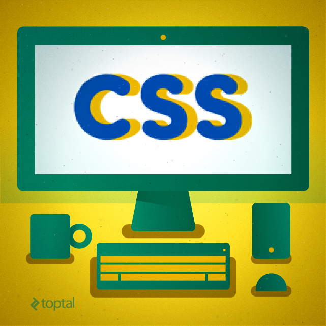
CSS For 4K Could, And Should, Be Better
CSS is the obvious place to start because it can make or break a site on a hi-def platform.
The problem with CSS dates back to the 96 PPI standard; that’s the default unit size. The unit size can be anchored, so you could tell CSS to treat one inch as one inch, rather than treating one pixel as part of a 96 x 96 pixel inch. You could also use reference pixels, based on the pixel size and the device-to-pixel ratio. This sounds like an elegant, solution, but in order to use it, you must abandon the one inch approach entirely.
Why is this a problem in 2015? After all, operating systems figure out the resolution and size of a display, and then come up with the correct pixel density for a screen. Browsers could simply tap into this data and render websites accordingly. Unfortunately, this approach does not work well, either. Web standards are a big problem, so sites that look good in 1080p might not look good in UHD without a big overhaul.
So far, the industry has been slow to respond to this problem, and it will become more obvious as people move to 4K hardware. CSS for 4K will be a hot topic moving forward, and we will try to compile tips and expert device to address this issue in the near future, so stay tuned.
More Layouts And More Hi-Res Assets Are Needed
Resolution independence sounds good, but it involves some elbow grease and forward thinking. Like most things in our line of work, it looks simple on paper.
You need to plan ahead, make sure that all your design elements are up to spec, all rasterised content is in the right resolution, and that your layouts look and feel good on different platforms. A website or web app designed in 2015 will have to stand the test of time and work properly on old 1080p machines, new 4K rigs, mobiles, high-res tablets and so on.
Here are some basic points of 4K web development:
- Plan ahead; today’s projects will have to work well on tomorrow’s hardware
- Make sure that all your assets are sufficient for 4K
- Use vector graphics and pure CSS attributes in lieu of rasterised graphics when possible
- Consider using more layouts than usual
- Ramp up testing
- Invest in new hardware, if necessary
From a purely technical perspective, developers and designers must make sure they have the necessary hi-res assets, and they also need to devise clear guidelines for content added to their designs. This means a lot of high-resolution images, stock photos, video, and vector graphics.
Vector graphics, fonts, and pure CSS attributes are already resolution independent and can be reused with ease. They will look good on any platform, and they won’t add a lot of weight.
On the other hand, high-resolution bitmaps and video will eat up bandwidth and storage. This may pose a problem on mobile platforms and even on the server side. If you are working on a small project hosted on an underpowered, shared or VPS server, storage and bandwidth could become a problem. Video might prove troublesome as well. Not only does 4K video require a lot of bandwidth and storage (plus, you have to produce 4K video, eating up more resources), it can be troublesome to embed it. Most people rely on services like Vimeo and YouTube for their video needs, but embedding 4K videos can be tricky.
You should also consider additional layouts. A mobile layout and a traditional layout aren’t sufficient, so experiment with additional desktop layouts for UHD screens, and possibly even layouts for high-def small screens (notebooks and tablets with 9- to 13-inch panels).
Testing new designs may require new hardware, as well, so keep an eye out for bargains.
4K Will Create Opportunities For Designers And Developers
From a business perspective, getting a head start in 4K development is a good idea. Although there is still not a lot of demand for 4K content, market research suggests we can expect strong growth over the next few years. Sooner or later, 4K will become mainstream and many websites and applications will need an overhaul. This means your clients will demand 4K designs tuned to perfection, so I suspect a lot of sites will have to be redesigned over the next couple of years. That’s why I strongly believe the transition to 4K/UHD will create opportunities for designers and developers.
We are still in the early stages of the transition, but it’s never too soon to start tackling upcoming challenges. When it comes to 4K, it’s really a no-brainer. We already know it’s coming, we know it will be big, and we know the industry hasn’t done much to get ready. If this is not an opportunity, I don’t know what is.
This post is intended to present a simple case for 4K web design, a brief roundup of all the vital points that need to be addressed. Since 4K will become more relevant moving forward, we intend to cover this topic from multiple angles in the future; tackling CSS, design, performance tuning and much more.
Related: Designing The UHD 4K Web Of Tomorrow, Please Start Today