Emails may be the standard means of written communication these days, but there are still occasions when only a printed letter will do. They feel particularly relevant now—in our digital-saturated age a delivered letter speaks volumes about the extra effort you’re willing to put in to impress new clients.

Letterheads come in a range of styles and layouts, and are the cornerstone of a branded stationery set. Whether you’re looking to design something more formal, edgy or unusual, you’ll find these ten tips for designing letterheads essential reading before you begin.
When you’re ready to design your own business letterhead, this tutorial shows you how you can create a complete branded stationery kit in Adobe InDesign.
We feature a number of great brand identity examples with creative stationary throughout this tutorial. So, you can grab the right one for your business needs. You can also browse a huge range of professional stationery templateson Envato Market to find something you can customize in a flash!
1. Where to Start? Go for Simple Shapes…
If you find yourself looking at a blank piece of paper and willing it to transform into a showstopping letterhead design, you might want to consider going back to basics first.
A letterhead isn’t a show-stealer—whereas you might design your website or business card to give it the real wow factor, a letterhead can be trickier to design as it’s not intended to be as showy. After all, the focus of the letter should be the text content, whether that’s a cover letter to a new employer or an introduction letter to a new client. The letterhead’s design serves to frame the text content in a professional way, without being too distracting.
However, that’s not to say that you can’t be creative with your business letterhead designs. Rather, try to aim for a minimal design that’s stylish yet subtle.
Simple, geometric shapes are great for adding a splash of color and style to your letterhead. If you already have a logo, why not try lifting a shape from the logo design to repeat in a pattern across a corner? Or why not take a simple shape like a triangle or diamond and repeat across the bottom of your letterhead, varying the size and applying your brand colors, like in thisgeometric letterhead template?

If you’re short on time, or need to produce something that’s a little more on the corporate side, geometric shapes are instant crowd-pleasers.
2. No Color Printer? No Problem!
OK, let’s think practically for a moment. It’s all very well designing a letterhead in an array of brilliant colors and finishes, but if you’re designing these for a working office you might find that in-office printers are going to diminish the quality of your designs.
So, what’s the solution if the company you’re designing for only have practical access to non-color printing?
There’s no need to shudder—you can easily create a letterhead design that will work equally well for color and non-color printing. Bright colors can appear dull and greyed out when printed on non-color printers, so aim for a strong monochrome design instead.
Don’t be tempted to apply huge chunks of black across your business letterhead—if the printer’s a bit dodgy these can appear lined or pixelated. Go for bold linear pattern instead. This stylish monochrome template shows how you can achieve a high-end, Art Deco-inspired style by using repetitive black lines. It’s deceptively simple, but looks fantastic, and would work particularly well for retail brands or hotel businesses.

3. Looking for Something More ‘Start-up’?
This might not be the best fit for a legal firm or an accountancy practice, but ultra-colorful designs can look amazing when matched with the right sort of company.
Technology and computing firms, start-ups and creative agencies can appear more forward-thinking and futuristic with a bold color choice. Even utilities companies can appear more optimistic and customer-friendly with a rainbow of brights at the top of bills and invoices.
Organic, curvy graphics are a perfect match for bright color. Also, a 3D style, with highlights, shadows and gradients, can look really impressive and help you stand out in a sea of flat design styles.
If you want to use a rainbow spectrum of color, avoid looking like you’ve gone crazy with paint by limiting it to just three or four related colors. This brand identity example with a colorful letterhead template shows how to achieve the vibrant look without compromising on style—a blend of curvy shapes is restricted to a palette of yellow, orange, pink and blue to keep it from looking too busy.

4. Apply a Strong Brand Design
Before you really get started with designing your letterhead, you need to have some basic but essential elements in place. If you have a strong brand design already to hand, you’ve got very little work to do—a visually striking logo and bold brand colors will be more than enough to start working with.
If you don’t have a logo and color palette, consider creating these for your letterhead. If you’re a freelancer and getting started with creating your own stationery, a logo, however simple, with your name and/or business name, is worth spending a little time on creating.
A quick and simple way to create your own personal logo is to write your own name, or set it in a handwritten font. This gives an instant personal edge to your stationery. This tutorial shows you how to use this technique to create a personal brand that you can use on resumes, letterheads and business cards:
Once you have your logo you can add personality and professionalism by teaming it with a great color combination. Seek out pairs of colors that complement each other and also give off the right signals about your industry and position in the market. For example, yellow and black/slate grey is an ultra-stylish combination with a masculine edge. This branded letterhead templatewould look great for a creative agency or web design company.
Other tried-and-tested color combinations to use are blue with white (perfect for tech firms), red with black (a strong, go-getting combination for grabbing attention), and neon or pastel with black (a hip combination that is jarring in just the right way).
5. Go Retro with the Right Typography
What could be more old-school (in a good way) than receiving a typewritten letter in the post? Play up the vintage appeal of opening a printed letter by using typefaces, layout styles and colors that reference times gone by.
I’m not suggesting you go all-out antique (although if you’re running a vintage store or a hipster coffee shop, then why not?), but a subtle reference to the golden age of secretarial letters, the 1950s and 1960s, will add a retro, stylish edge to your letterheads.
Typography is key to achieving this look. Typewriter fonts come in many forms, some more novel than stylish, so look for typefaces that have a geometric style, without aged effects to keep it looking slick. Manson is great for giving headers and logos a look that would be worthy of the International Style, while Source Code Pro is a legible, simple take on the typewriter style.
Don’t let the retro style drift into novelty territory by keeping your business letterhead design minimal. Take inspiration from this subtly retro letterhead design—include plenty of white space and stick to a simple two-tone color palette.

This rusty peach looks great contrasted with a strong black. Positioning color imperfectly behind the header also adds to the 60s letterpress-style look.
6. Use a Watermark
With border or corner designs on your letterhead, it sometimes feels like there still isn’t enough room for the text. If you have a tendancy to write long letters, or would rather just not reduce further the amount of space available on the page, a watermark is a fantastic solution for adding color and graphics without sacrificing space.
It’s also a great solution for the dodgy office printing situation (see item 2, above) where you might not even be able to print to the trim edge of the page. Position a watermark in the dead center of the page and there’s no chance of elements of your design being chopped off by the printer.
Watermarks may be one of the oldest stationery tricks in the book but there’s an art to getting them right. Too dark and they can obscure text, too pale and they can lack impact.
What I recommend is that you set the transparency or tint of your watermark to much paler than you would first expect. A 5-10% color tint will look just right, even if it appears very pale on screen.
Adding a paper texture background behind the watermark and setting the transparency mode of the graphic to multiply will also pull through some nice texture and add interest and a tactile quality to your letterhead, whatever paper you print on.
Lifting graphic elements from a logo is the perfect starting point for a watermark design. This branded letterhead template lifts the chain-link shape of the company’s logo, and pales the color to a pleasing soft pink.

7. Know When to Keep it Simple
Not every company will suit a look-at-me letterhead; sometimes the simplest designs will be a more suitable choice for corporate businesses.
Don’t get carried away if you’re tasked with creating a letterhead for a business. You may well be able to create stunning graphics and artful typography, but will that sort of look actually suit the business you are designing for?
If the company is likely to share written correspondence with legal or financial firms, it may not be appropriate to use a letterhead adorned with metallics, bright colors or quirky illustrations. It takes a brave designer to do something really creative, but an even braver one to create something elegant and minimal instead.

But don’t assume that simple has to mean boring—minimal styles require extra precision and time to perfect, and the result can be beautiful. This ultra-simple letterhead template shows how restraint can be a strong and appropriate look for a more formal letterhead.

In your own designs, limit yourself to just a few key elements for your clean design—one color, one logo, and a simple border or trim. Position the text content of the letter off-center to increase the amount of white space on the page, and visually declutter the layout.
8. Fun Company? Make a Fun Letterhead!
If you’re lucky enough to be given a letterhead design brief by somebody really fun (whether that’s a creative agency, or yourself!), you need to ignore all the advice I just shared in item 7, above.
If you’re designing for a creative, young company, like an agency or retailer, they might use written correspondence to share information about promotions and events with customers. For this, they’re going to want to have a letterhead that really catches the eye.
This is the perfect opportunity for you to flex your creative muscles and design a letterhead that balances the optimism of the brand with an on-trend design.
Flat graphics are a great way of bringing color into a design while keeping the layout looking fresh and contemporary. This playful brand identity example with a fun letterhead template uses repetitive, curvy elements with a retro-inspired color palette and a flat design style.
Just allowing the graphics to peek out from the corners of the letterhead keeps the layout fun but conservative on space. This sort of design would suit a children’s retail company or a youthful food brand down to the ground. It’s also super-simple to achieve, involving repeated shapes. It’s the flat style and trendy color palette that keeps the design looking young and exciting.
Looking for something even more fun? This tutorial shows you how to create a complete stationery set for Professor X’s School for Gifted Youngsters:
9. Use Borders with (Extreme!) Caution
It all starts out innocently enough—wouldn’t a nice border frame my letterhead just so? True, borders can add a beautiful finishing touch to a layout, but their impact can be severely diminished by the restraints of in-house printing.
Unless you’re planning on professionally printing your letterheads and having them carefully trimmed, avoid a trim-edge border at all costs. In-house printing can result in a wobbly, off-centered border or, even worse, a partial or lopped-off border that makes the letter look sloppy.
If you’d still like to take advantage of the framing qualities of a border, place your border on the margin (not the trim) edge, allowing it to frame just the text sitting within. Keep the border thin and minimal to avoid restricting your letter and making text appear constrained.

This bordered letterhead is a nice compromise—a trim-edge border looks fantastic if you have the budget and patience for professional printing and trimming. If the outside border gets lopped off by the office printer, there’ll be no need for tears; the inside border will remain and it looks particularly elegant teamed with footnote icons and a ribbon logo draped over the top edge.

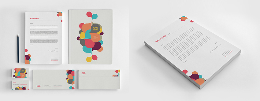
10. Repeat Elements Across a Stationery Set
If you’re making the effort to create a branded letterhead for your own personal business or that of a client (and believe me, it’s worth the effort!), you really should consider extending your design across a complete stationery set.
This may sound like a lot of work, but it’s actually relatively simple to do once you’ve pinned down a brand ‘look’ for your letterhead. As we looked at earlier, geometric shapes are really easy to design, look incredibly effective and are versatile enough to repeat across other items, like envelopes and business cards.
Once you have the basic stylistic elements of your letterhead in place, such as graphics, pattern, color and a logo, repeat these elements across other stationery designs. Switching up the color is a great way to add interest while maintaining a consistent look; or why not take inspiration from this branded stationery set, and subtly tweak the scale and position of shapes to create a unified design?

Promoting consistency across all of your stationery items really is an extra-special touch that will make your ‘brand’ appear incredibly professional and pulled together.