From a descriptive and simplistic point-of-view, typography is the art and technique of arranging type.
Most people never think about typography. They don’t understand the psychological effect it has in relation to conveying a message.
If you have ever seen the movie, “The Holiday”, then you know that Cameron Diaz’s character, Amanda Woods is a movie-trailer maker. In one scene she asks her co-workers to make the type for the movie header she’s working on, “twice as big, but try it in a red, like a happy red, not a Scorsese red.” That’s all part of the art that is typography.
Typography is 95% of design – it’s a driving force in all forms of communication art. Can you imagine reading a magazine, checking out a website, playing with an app or watching TV without text?
Why Typography is important:
1. Conveys a “feeling”
The choice of typeface can affect how a piece is understood. Consider these two examples below. Which is more appropriate considering the title of the article?
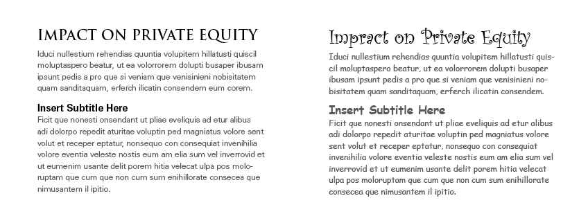
Most people would automatically choose the example on the left. The font size and type elicits a feeling of power, seriousness and importance; while the example on the right is fun, light and playful.
2. Keeps People Reading
Good typography is utilitarian in that it should allow the reader to focus on the content and not the formatting. Good typography often goes unnoticed because it just makes sense. Consider these two examples below. Which article is more legible and user-friendly? Which would you rather keep reading?
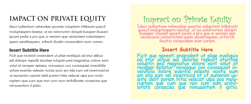
The example on the left is clear, simple and easy to read. The right example has too many colors, font styles, all on a background that is very disconcerting to the eye.
Elements of Good Typography
- Consistency – in any typographical work the consistent use of typefaces, kerning, leading, bullets and formatting is critical. Consistency makes the work look professional and keeps your readers focused on the content and not the formatting.
- Hierarchy – it is important that your text gets read in the order that it’s meant to be read in. Take a book for consideration; the title is the first thing a reader sees, then the author’s name, followed by the chapters and then the story. Hierarchy intentionally guides the reader through the content. Often with best selling authors, their name will appear larger or the same size as the title of the book. This is because the designer is aware the author has an existing fan base that will be interested in the book regardless of the title and will most likely pick it up for that very reason.
- Alignment – Alignment helps keep the look of a piece unified. A flush left or flush right alignment gives the piece a stronger edge line for the viewer’s eye to follow. It also tends to give a more sophisticated look than a centered alignment, which is often the choice of typography novices.
When using a designer, or a design firm, make sure to review samples of their work. If you have a difficult time feeling connected to the piece, ask yourself a simple question, “Is it the content that just doesn’t grab you (maybe because it’s something you have no interest in), or is it something more?”
When you are reviewing drafts and you don’t question the typography because it isn’t an issue and you get the feeling and the meaning of the content, then the design firm has done their job, and done it well.
Now that you have been given a basic overview of typography and its importance in everything from a book, to a blog, to a letter, you can take it into account when you work with a designer on your own organizations communications.