Getting the balance just right
Mark Jamra is someone who understands the importance of letters. He is not only a typeface designer with impressive language support experience (see his typeface Phoreus created for the Native American Cherokee language), he is also a graphic designer and educator with an understanding of what makes letterforms work together to form a distinctive word mark.
A wordmark has different typographic needs than a typeface, and Jamra will lead a two-day Wordmarks Workshop on Tuesday–Wednesday, June 14–15, to help other designers understand what those needs are.
The terms “logo” and “wordmark” are often thrown around as the same thing, but Jamra says “a logo is more of a symbol, whereas a wordmark is more of a readable configuration of letters. Unlike the Nike swoosh, which is a logo in itself, wordmarks are most often language-dependent”. Jamra sees a distinct difference and advantage in creating a custom wordmark rather than simply relying on a stock typeface for a logo. “There is a right way and a wrong way to modify existing fonts. Anyone can make a wordmark by setting a word in a font, but there are things that can be done to make the wordmark unique”.
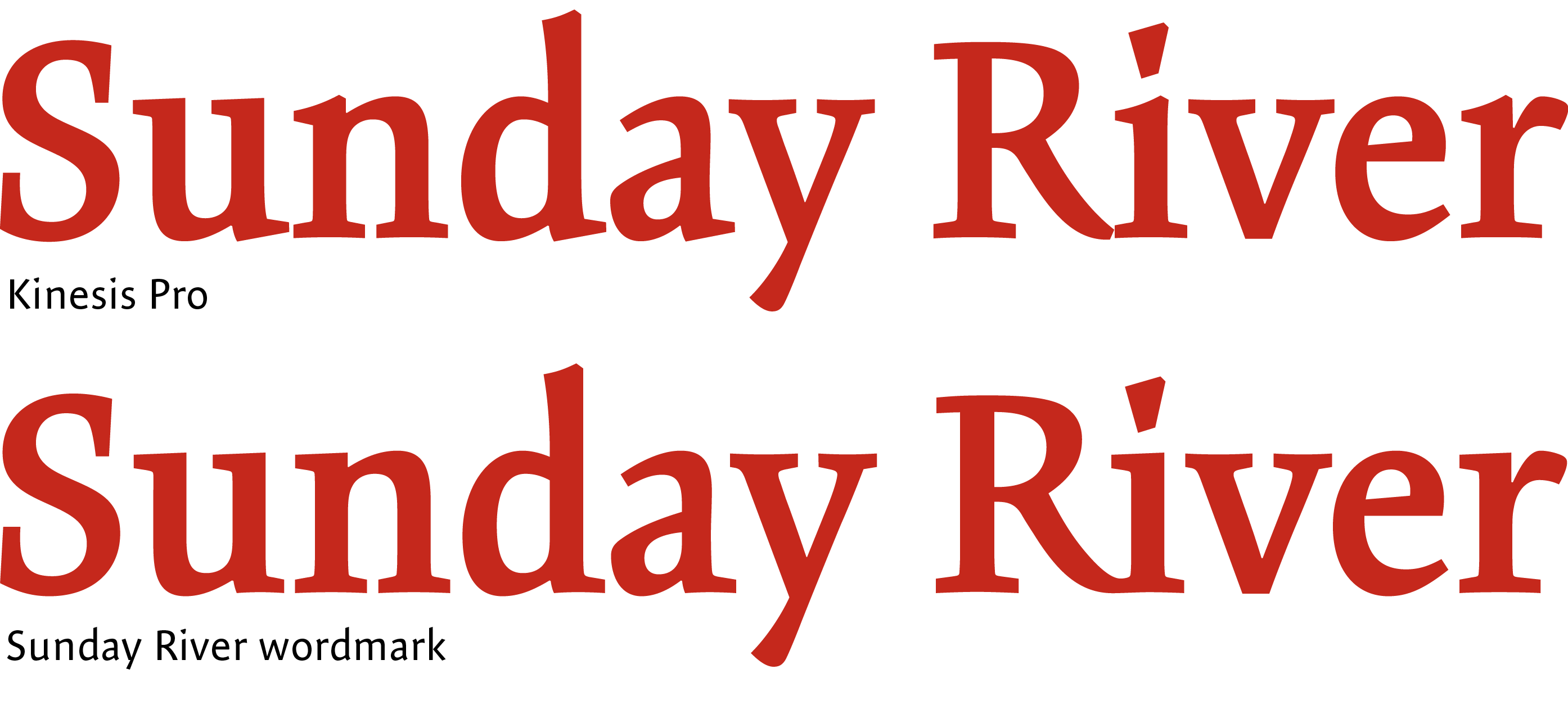
Jamra says wordmarks have their own “typographic DNA” that shows how every element speaks to the other elements of the whole. With a wordmark, it is important to find the commonality of the elements. Setting a wordmark in a stock font can give you part of what you need, but there is much more possible if you start from scratch. “If done right, you have shapes, moments, and gestures that speak to each other across the wordmark. You sense that there is something in each letterform that is addressing the other forms and making a better whole.”

