The best way to create the perfect Brochure, Poster or Business Card is for a designer and their client to work together. Both parties should be involved in each step of the project, from idea generation to printing.
Often times, unfortunately, one or both of them assume that prepress and printing should be handled exclusively by the technicians at a print shop. This is a mistake!
The danger of having someone without a design background make modifications to your file is that it can result in unwanted design modifications that undermine the overall effect of the intended layout. If you want to ensure nothing gets lost in translation between your desktop and the print shop, conducting your own step-by-step prepress examination of your design files can save you time and a batch of headaches. It can also save you a ton of money!
According to large-volume print production expert Allen Glazer, 25-75% of a design project’s budget should be set aside for printing costs. If you don’t catch a mistake in prepress, it will be much more costly to fix down the line.
Preparing graphic design files for printing can be quick and easy once you know what elements to look for. To give you the upper hand when it comes time to print, we’ve put together a prepress checklist that covers everything you need to look for when finalizing your proof. It incorporates everything from simple editing to advanced technical procedures. And of course, both designer and client should be involved. Here’s our prepress checklist to help get you started:
1. Proofreed Proofread everything
Small oversights, such as typos and grammatical errors, can be the difference between closing a sale and a customer choosing the competition. A poll from Standing Dog Interactive found that only 3 percent of people didn’t mind errors, whereas most consider typos and grammar mistakes a deciding factor in whether to continue reading… or not.
“Negative web user experiences hurt sales,” they write, “and the findings in this sampling indicate that typos and grammatical errors will likely cause a major segment of a company’s potential customers to have a negative experience on its website.”
Catching errors is even more important when you’re printing. Once your design is in the hands of your consumers, there’s no way to update it in real time.

There are two types of proofreading you’ll need to address before you send your file to press. Linguistic proofreading covers what most people associate with editing: checking for grammar mistakes, typos, spelling and the overall flow of the language used in the ad.
Prepress proofreading (or graphic proofreading) touches on the visual appeal of the text from a graphic standpoint. Look for splitting words at the end of line breaks, the length of lines themselves and even text spacing. The biggest thing to be aware of is maintaining consistent line lengths when breaking sentences. Longer or shorter lines stand out and can really throw off the general uniformity in a block of text if not spaced properly.
2. Check font spacing

Once you’ve finished proofreading, it’s time to set the text spacing. Most fonts and design programs come out-of-the-box with some degree of optimization, but not adjusting your fonts using your own visual judgment will often leave them looking a little off.
Classic typography procedures like adjusting the leading, tracking and kerning of your text is central to creating the the unique look you want to make your design stand out. Think of your entire image as a composition: each punctuation mark, letter, block of negative space and paragraph must work cohesively with the others to create a seamless experience for the viewer of your design.
3. Confirm image size and resolution

Double check the resolution of your imagery before printing. This means not only noting the resolution of photos in your design, but also the resolution you save your whole final draft at.
Print items should be saved at 300 DPI or more, but as Sara Duane-Gladden at SpeckyBoy writes “a good rule of thumb is to always save your design files at the highest resolution possible. Though you can scale an image down if you must, it is impossible to add pixels after the fact.”
In general, it’s best to never enlarge photos more than 20 percent of their original size. Resizing images in your document changes the output resolution of your image in the document as well. This is especially true for large-sized flyers and brochures, and advertorials with photo-quality images. If you are printing on canvas however, 100 DPI can suffice up to a certain size.
4. Ensure color accuracy (CMYK vs RGB)
When it comes to printing your design files, what you see on screen is oftentimes not what you get from the printer. One way to ensure that what you see on your screen will match what comes out of the printer is to check the existing color mode of your design.
Computer screens and digital cameras view color and light in different spectrums than printers do, and failing to sync the two will reflect horribly in your print. Electronics that produce visual light or interpret it via a sensor use the RGB spectrum to make colors, because mixing light in these colors is easy and smooth.
Most (if not all) design software programs use the RGB color mode by default. Printers, however, use the CMYK process to overlay different intensities of each tone and create the full range of colors. This additive process—as opposed to the subtractive RGB system—involves adding color to create deeper colors on the way to black, not adding light to move away from black.
5. Calibrate your screens
Another way to ensure color accuracy is to calibrate your screen before you print. When you are printing mock-up drafts, the true tone of your colors can easily be thrown off by a screen that is inaccurate.
Graphic designers and photographers have a range of tools to check the color accuracy of their images before sending a design off to the press, and making sure your imagery is correct before you send your specs to the press can quickly save you a whole lot of money in misprints.

It’s important to realize that customers and designers may have their monitors calibrated differently, which could lead to issues in communication. It’s often helpful to view a design on several different devices to see if that’s a potential issue. Or, even better, to print the design off! While the colors won’t perfectly match those that you’ll get from a professional printer, this small step can help you notice small differences you’re not seeing on your monitor.
6. Define bleed and crop marks
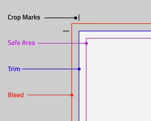
Taking your design from the digital realm to the physical involves making sure your file’s bleed, crop and cutsare lined up properly. These marks indicate the edges of your design and where cuts should be made once things are printed. These will give your design that professional, designed-all-the-way-to-the-edge-of-the-page feel.
Crop marks indicate where your design will be cut, and the bleed is where parts of text or objects extend past the page boundary to compensate for trimming. The slug is an area that is well outside the bleed that features printer instructions, additional info on the print, and other need-to-know stuff about the job. Ignoring the bleed will run you the risk of having a white border along one side, where the physical paper extended beyond your digital design. Not pretty.
If your text or images buttress the crop edge or a fold, it’s also immensely important that you consider the cutting tolerance of your chosen paper. Subtle differences in your layout can make a big difference when it comes to symmetry once your flyer is cut or bound.
7. Take care of imposition
No, it’s not just that annoying dude at a party who keeps following you around and trying to inject himself into all of your conversations… In printing, imposition is the process of arranging all of the pages of your design onto the paper in order to print faster and reduce extra paper waste.

Taking bound materials to the press used to require a lot more organization. From lining up pages to ensuring they are evenly set back to back when printed, printing booklets and multi-page pamphlets was a task. Thanks to Adobe Publisher, and similar layout-oriented programs, setting up a multi-page design to be published in a brochure or booklet is much easier.
Tip: remember to add a little extra space to your design in the center to compensate for the binding.
8. Create a high-resolution PDF
Once you’ve gone through every step, it’s time to save your proof. PDF files are mostly lossless printable file formats perfect for just this purpose. Once you’ve got everything saved in PDF, you’re ready to go!
9. Select the perfect paper

The right paper makes all the difference. The last step before you send your design along to the print shop: choosing your paper.
Different types of paper create a different feel and visual appeal than others. For example, you can often get the same type of professional results you want with a less expensive semi-gloss paper rather than a heavier matte. Spend a little time considering which type of effect you are looking to create before you start printing.
Going through prepress and looking for red flags helps you preserve the integrity of your design from concept to final print, so nothing gets lost in translation. Prepress helps you catch the little errors that become big mistakes when they find their way to the print shop—errors that render hours’ worth of thought and design moot immediately. With only a couple quick steps, you can save money, while you make sure that the work you produce is up to your high standards every time.