This is the first of a series about 2017 design trends—color, typography, and web trends.
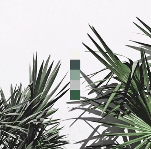
Kale is Pantone’s number one color pick for 2017. Pantone has an impressive history of color influence and prediction. Last year’s color of the year was Rose Quartz and it was seen everywhere from interiors to fashion to web design.
As you update your websites and create marketing materials for 2017, keep this color palette in mind to keep your image fresh!
The Color Marketing Group, a worldwide color advisory agrees, although the color they site as number one is a green called “Thrive”, which they say symbolizes a balanced, energized future for North America. CMG breaks their color predictions down globally but they are very close to Pantone’s predictions.
Here is Pantone’s palette compared to Color Marketing Group’s.
This is not Color Management Group’s full list, but look how close their predictions are:
Almost exactly the same!
Many people think that color, typography, and images are “pretty.” They are not. Although color and typography may be beautiful, their job is to work together to present an image—to visually express the character and intent of an organization or individual.
Your use of color, typography and images say everything about you—especially in today’s world where people don’t’ read as much as “view” something to get an insight, a feeling, a concept about what they see. If you can capture a viewers attention, you have a much better chance of getting a response to the action you’d like them to take, for example, give you their email address.
Be careful to use color, typography, and imagery that appropriately reflects your business communicates your image and attracts your audience.