This is the time of year where everyone starts to think “new.” New year. New resolutions. New design trends.
While we can’t say for certain what the biggest concepts of 2017 will be, there are some indicators. Late year trends often signal things to come in design. Some of it will be device-driven, other trends are recycled bits of things we’ve seen in the past. Either way the new year is a great time to step back and think about what fresh design elements you plan to try this year.
1. More Serif Typefaces
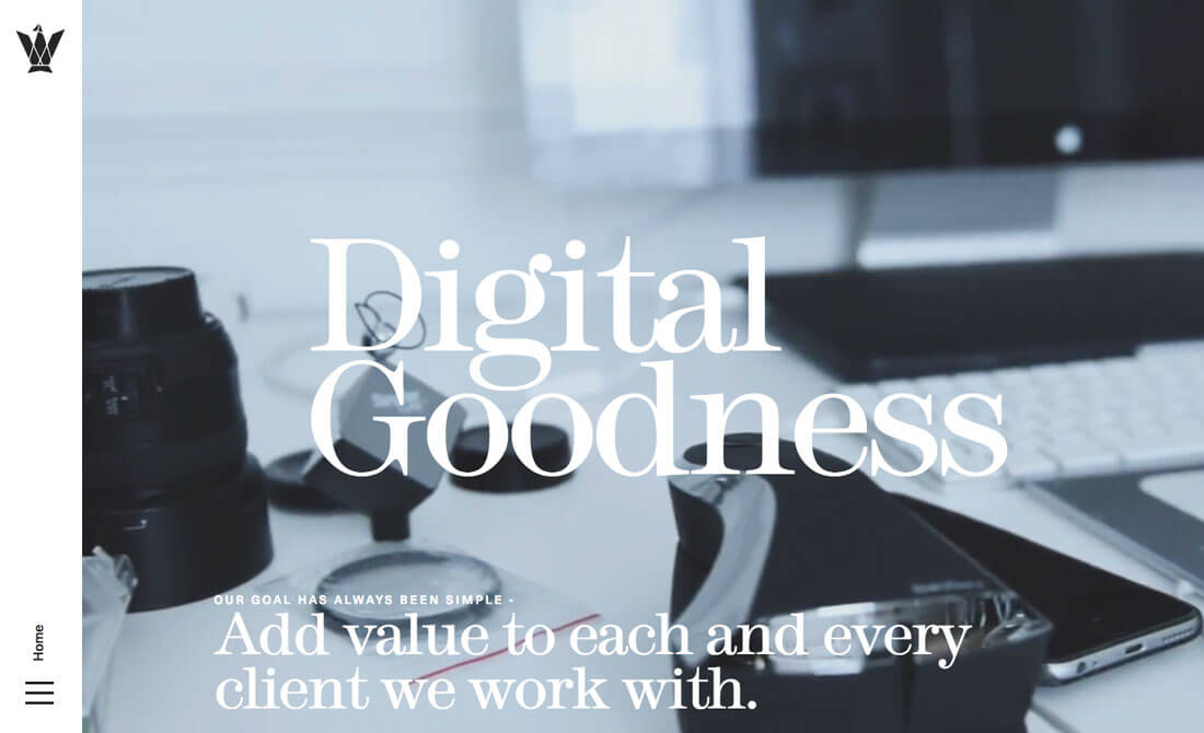
Move over Helvetica, a new bunch of typefaces are about to take over home pages. Big, bold typefaces have been a big deal for a while because so many design use strong hero-style images with text overlays.
Most of these designs have focused on sans serif options. But not anymore.
Serif typefaces can be a beautiful alternative to (dare-we-say) sans serifs that have been dominating web design for years. There’s a reason for the change.
Sans serifs have long been thought to be more readable on screens. Serifs and thin alternating strokes can disintegrate at certain sizes or screen resolutions. But more people have high definition screens on all their devices, leading to enhanced readability. So go ahead use those serifs!
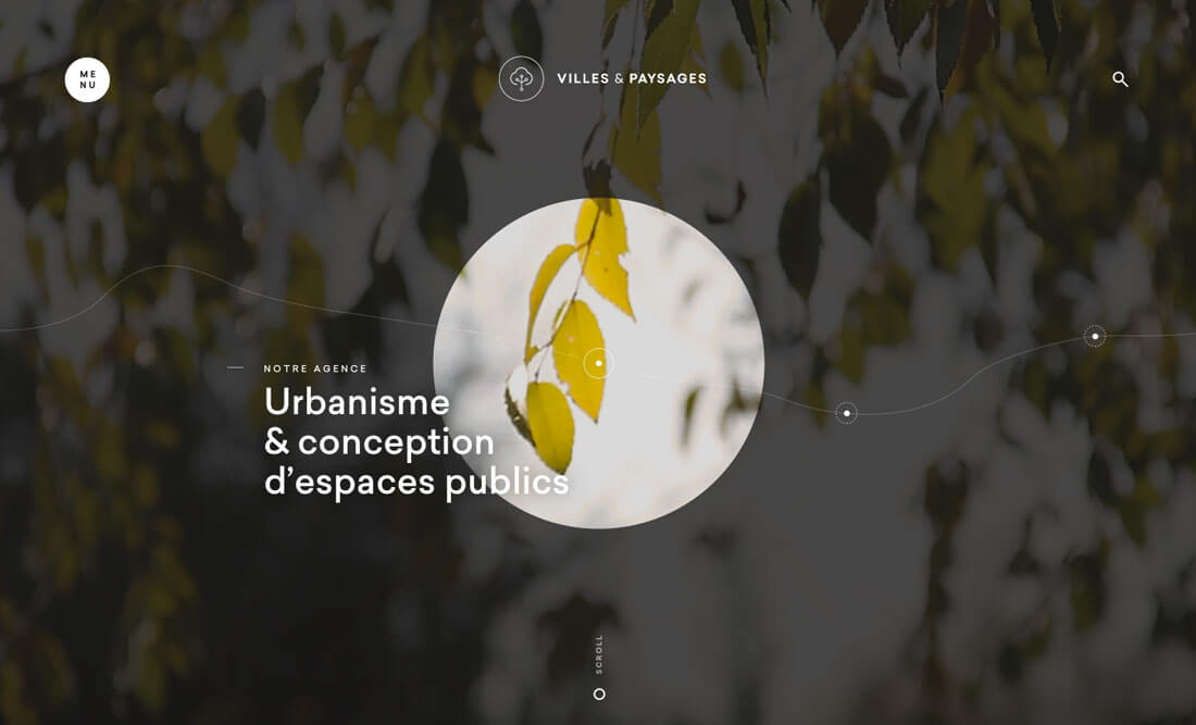
2. Dark Aesthetics
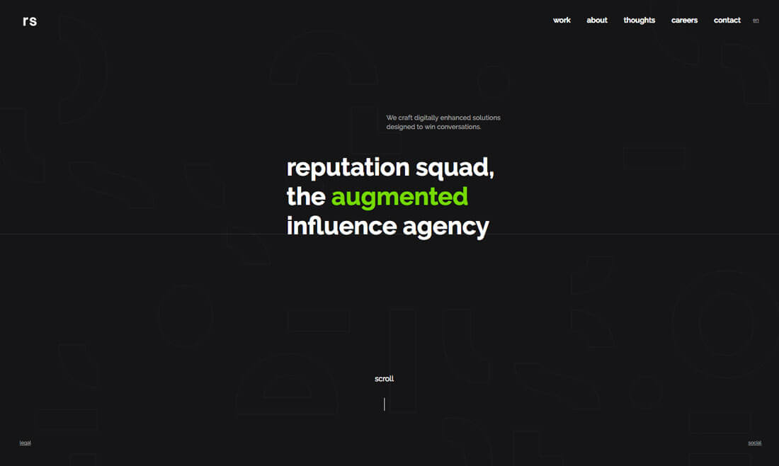
While 2015 and 2016 saw a lot of minimal website designs with white or light backgrounds, dark backgrounds are returning to fashion.
What’s nice about this trend is it is just a flop of the aesthetics to be on trend with light elements becoming dark and dark elements becoming light. As long as your accent colors provide enough contrast it can be a fun way to spark new interest in an older design.
The other thing that’s starting to emerge with dark websites is a more monotone color palette with just a few colors or color that’s reserved just for photographs. While this may sound stark at first, a look at these designs shows that the contrast between dark and pops of color is a great way to draw the eye and encourage user interaction.
3. Natural, Neutral Color Palettes
Pantone picked a natural neutral for its color of the year – Greenery – and if what we’ve learned in past years holds, this will be a major color trend in 2017. Pantone colors of the year often shape color trends for the year to come, rather than showcase trends that have come and gone.
More natural or neutral palettes continue to play off minimal aesthetics, giving designers a hint of color without shifting to a super-bright palette. Many of the color choices include natural hues – greens, browns and blues – or metallic neutrals such as gold, grays or rose gold.
4. Geometric Details
From circles to squares to triangles, geometric accents are taking over. The best geometric patterns aren’t that obvious and provide user interaction cues, make the content easier to read or navigate or provide interesting visual divots for buttons or calls to action.
The trick to making this trend work is simplicity. Don’t overthink it. If you like circles, for example, consider using them for a single type of element throughout the design. This shape can make a great container for icons or frame for staff photos.
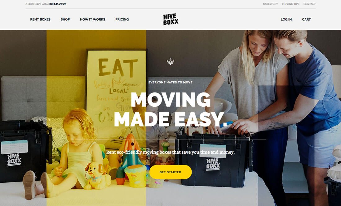
Another option is to use geometry to create an interesting almost-patchwork style background image. Smaller shapes can feel dainty and light with a pale color choice or busy and energetic with bright colors. Oversized shapes might not be easy to identify at first but can be a good way to add color or contrast in just the right places, such as the color overlay featured on the Hive Boxx homepage (it highlights the product in the image).
5. Oversized Type
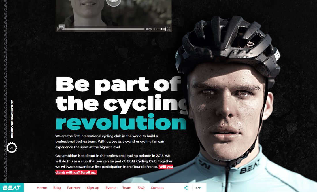
While some designers have been using oversized typography for a while, in-your-face lettering is going to continue to get bigger and bolder. From single word homepages that ask users to move through the design on a whim to words in interesting typefaces or with splashes of color, text is more important than ever.
The logic behind these type choices is to grab attention. Every designer has to come up with a way to make their design stand out from the rest. What is most likely to grab someone’s attention in the crowded web landscape? It’s likely something different; something with a lot of contrast or a super-strong visual.
Super-sized lettering can often fit the bill. Beat Cycling does a great job with typography. They typeface is interesting and just a hint unexpected while the color choices draw the use into the design.
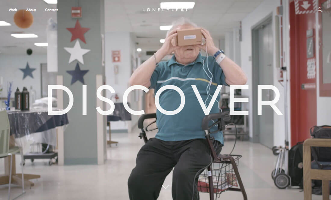
6. VR Wannabes
Virtual reality seems to be all we are talking about these days. The devices have a definite cool factor and there’s a lot of talk about how to design for these unique device-based experiences. You can also fake it.
Plenty of designers are creating device-less VR experiences in their site designs. This includes everything from games to 360-degree video to movie-like experiences. The only real commonality is that each of these designs has a goal of making the user feel like they are part of the experience, and they don’t want to leave this imagined world.
There aren’t rules yet for exactly how this looks. VR designs range from realistic displays to completely animated fantasies. It all depends on the type of user you hope to draw to (and through) your website design.
7. New Navigation Patterns
Designers have been experimenting a lot with different navigation patterns. For a while every menu seemed to be anchored to the top of the page. (And many still are.)
But with wider aspect ratios on screens and hidden navigation becoming standard on mobile devices, the pattern has started to shift to side and hidden styles for desktop websites as well.
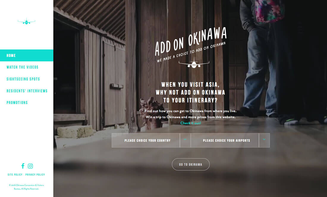
This small shift completely changes the perspective of the website – look how sleek the side navigation is on the Okinawa site – and changes the size of the canvas to be designed. It creates different types of spaces, which can be visually interesting even without a lot of other flair.
Hidden navigation that pops into a full-screen menu is the style that’s most likely to rule though. The user pattern is already understood and accepted because of widespread use on mobile devices. Desktop users don’t fumble with this style of navigation and with a “sticky” icon for the menu, it can travel throughout the site without getting in the way of other content.